I make a living kicking around words. I write every week in preparing a sermon and daily for this blog. I have been invited to write in other circumstances, including for two Lenten booklets for the national church. At the same time I am a very visual person and couldn't imagine my world without imbibing deeply of the natural beauty around us and the powerful statements of art and architecture.
To that end I included visual images in worship long before Powerpoint came along. Twenty years ago I began using overhead slides in sermons to illustrate what I was saying. When projection became more common in places of worship I was quick to embrace it. It is rare for me not to use visual images within a sermon, and while I sometimes include quotes, I am far more likely to use photographs and works of art as illustrations. I'm always trying to figure out whether images are enhancing or detracting from the message and when less is more.
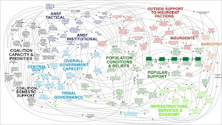
There has been a lot written lately about the perils of Powerpoint, in any setting. The illustration above was part of a US military presentation on the situation in Afghanistan. Little wonder we are still there.
There are times when it seems that presenters are enthusiastically using projection without much sense of context or moderation. A family member was relieved when the interim minister in her congregation moved on. He seemed to be keener on bombarding them with images with his new toy than on the content of his message.
What are your thoughts on the augmentation of messages with images? Would you rather listen than look, are both helpful?
5 comments:
Please don't stop with your pictures! I think they really enhance your message. I always look forward to what you have dug up for us to look at.
I think images are great. What I don't like is when people do powerpoint presentations and each screen is filled with words. They then proceed to read each page. I once heard that powerpoint slides should not have more than a few words on each one.
Probably the best speaker I have ever listened to(after David of course) was at a conference years ago. It was Dr. James Reese, and although he did have a powerpoint, I don't think there was even ONE word on it!
Combining words with images also helps avoid the audience from mentally drifting.
I love using powerpoint. I especially love it for the music. It's nice to have people's heads out of the hymn books.
I was also asked recently if I could add more images to the music. People seem to enjoy the added imagery to the words of the hymn.
I love words the most, both written and spoken.I don't dis-connect with pictures but find my greatest connections in well worded notes, books, or listening to an eloquant speaker or singer of songs.
PS David...you are both a gifted wordsmith and speaker....singer, I'm not sure?
This is a huge issue for me in terms of my own work, and the debate between supporters and detractors of technology as an enhancer of education is presently at full throttle.
In any case, I think as long as you have your message in mind and use visuals judiciously to draw your audience back to it, you're in good stead overall.
Post a Comment